
CHARLESTON, W.Va. — In the Fall of 2020, I undertook and led a project to redesign two Lincoln County newspapers — The Lincoln Journal and The Lincoln News Sentinel. Both weekly publications have chronicled many decades' worth of southern West Virginia history. At the time of this redesign, Hamlin-based Lincoln Journal, Inc. published both papers.
The redesign came at a pivotal moment for both publications and the newspaper industry as a whole. The new layouts were launched amidst a still-raging pandemic when information moved quickly, and overall trust in media was on the decline. Papers throughout the country — and indeed, worldwide — were experiencing a decrease in subscriptions and the slashing of advertising dollars, and COVID-19 only made the situation worse.
It was against this backdrop that the redesign was launched.
A fresh look for two storied papers
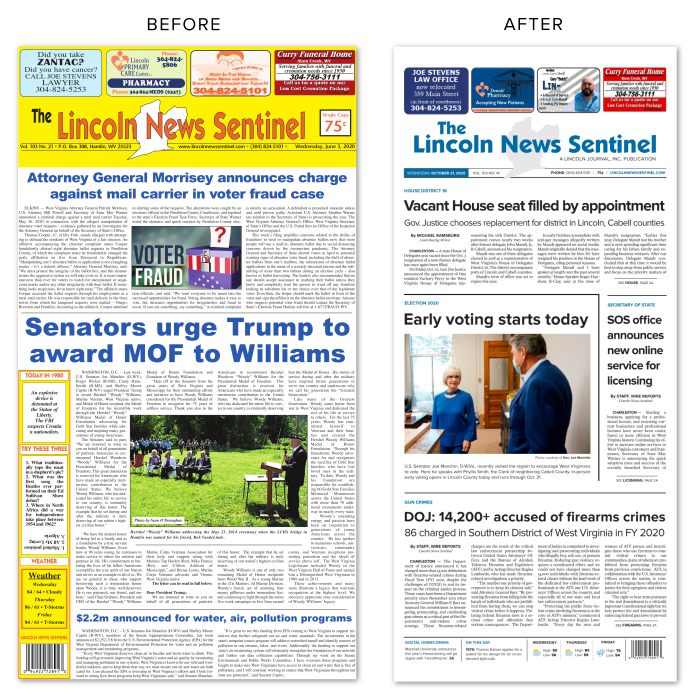
Though the project had been in the works for several weeks, the initiative found momentum when the printer announced they were changing the newspapers' page width. HD Media, which had been printing both the Journal and the News Sentinel on their Charleston-based press for several years, had recently changed publishing technologies. All publications printed on HD's press, including the Lincoln Journal Inc.'s papers, would now be reduced from 12.5 inches to 10.5 inches in width — a 16% reduction. Readers would no longer receive a broadsheet-sized publication each week. Instead, the size reduction meant each paper would now have dimensions similar to a supermarket tabloid.
This change in publishing size proved to be the perfect time to freshen the newspapers' look.
Besides the reduction in newsprint size, the most notable change made to both newspapers was its masthead, the invariable logo that had carried the papers through the decades. Though the nameplate of each publication would change, I put considerable thought into keeping the overall look and feel of the original designs.
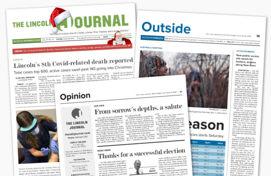
For the Lincoln Journal, the new logo would keep the same font, Masheen, as it had historically. I chose a slightly darker shade of green as the paper's anchor color and enlarged the word "Journal" with the letter J- silhouetted in a green circle. This shape evokes a rising sun, representing the continued ascent of the paper. This emblem could also serve as a stand-alone logo for the publication, used in advertising and other forms of marketing. It would also make it easy for readers to identify the Journal on social media and other web-based communication tools.
The logo wasn't the only item to change in the Lincoln Journal's masthead. Then-publisher Tom Robinson also changed the paper's tagline. Before the redesign, the slogan read, "Discussed by many, Cussed by a few...Read by all." Tom changed it to: "Striving for a better Lincoln County, a better West Virginia, and a better America."
Similarly, the News Sentinel also kept the same font family, Koblenz, in its new design. A bolder version of that font was incorporated in the redesign, giving the masthead a more modern feel. Blue was selected as the paper's new anchor color, as reflected in the nameplate's typography. I transferred the outline of Lincoln County to the new masthead, this time filled with a light shade of gray to compliment the blue.
A community-focused design
The most exciting changes to both papers' designs came in the actual layout. For starters, I utilized more whitespace to emphasize individual articles. Graphic elements, including new headline and subheadline typography, were implemented on a visual hierarchy, giving the page a more refined look.

See more: Download a PDF portfolio of some of my newspaper page designs here.
Because the way we read and interact with the modern newspaper has changed, so too did the way information is presented in the new design. Anchor stories on section fronts, including the front pages of both papers, were appended with graphical elements (boxes, etc.) to emphasize their importance in the overall design. I added drop caps to anchor stories too. I also included pull quotes in some articles, using them to excerpt some of the most exciting parts of the story.
Additionally, the redesigns also implemented visual elements for finding information quicker. I used kickers at the top of the front page and section page articles -- and even on some articles on inner pages -- to assist readers in quickly identifying the story's topic. Adding weather graphics helped readers rapidly recall the day's expected forecast. I included story previews on section fronts to tease exciting stories on the papers' inner pages.
The redesign also emphasized a connection with the papers' online presence. Graphic callouts were implemented on individual articles, pointing readers to related stories, photos and videos on the newspaper's website. Additionally, I used QR codes to direct readers to exclusive online content, bridging the print and digital aspects of the papers' brand.
In addition to the visual redesign, both papers also received new features and sections.
The News Sentinel implemented the most extensive feature transformation. Before the redesign, this paper featured little local content, mainly publishing regional and state news and features. Implementing small amounts of local content was an editorial priority, and the addition of new sections bolstered the new content. A Food section showcased family-friendly recipes and other food articles from local and national sources. An Outside page highlighted regional and statewide recreation opportunities and information on hunting, fishing, and other game sports. Both sections ran on a biweekly basis — the Food section one week, the Outside page the next.
Altogether, the 2020 redesign of the Lincoln Journal and the Lincoln News Sentinel represents a milestone in the history of both publications. Elements of the redesign, particularly the introduction of print/web bridges, will undoubtedly help the paper navigate the printing industry's future challenges.
Does your small or medium-sized news organization need an affordable publication redesign? Connect with me to learn more about how I can help.